
Vodafone
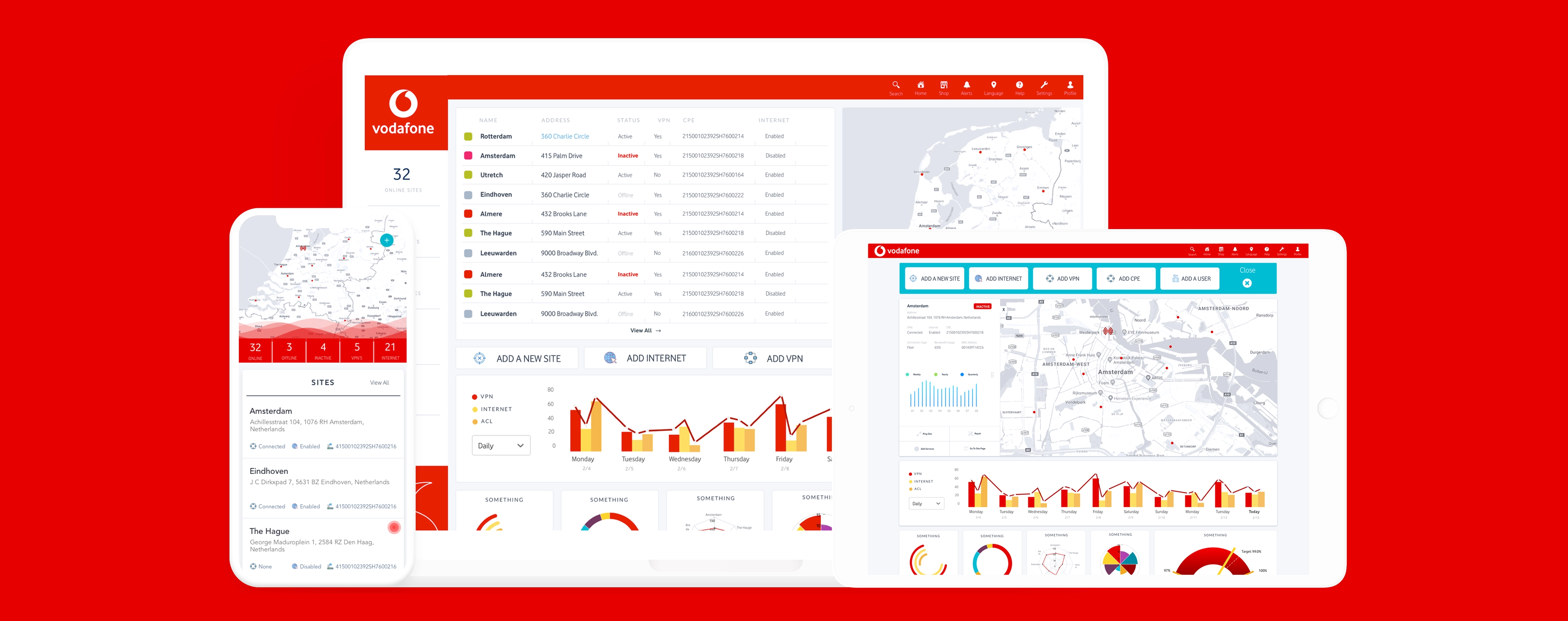
Vodafone's global operations teams needed to process enormous volumes of real-time network data across regions and roles. We designed a configurable dashboard ecosystem — maps, alerts, KPIs, predictive charts — built for fast scanning and deep exploration, responsive across desktop, tablet, and mobile.
- UX/UI design
- Web development
- Dashboard design
Toasty Labs designed the dashboard ecosystem Vodafone’s global operations teams use to monitor network performance in real time. The engagement covered UX and interface design for the full product surface — maps, alerts, KPI views, and predictive charts — plus front-end development, delivered responsive across desktop, tablet, and mobile.
The problem: technical data, many regions, one interface
Network operations at Vodafone’s scale produce more data than any single view can usefully show. The product pulled from layered data sources, served different regional use cases, and reported deeply technical operational metrics — and all of it had to work for engineers scanning for an anomaly and for managers reading a regional summary.
Designing one interface rigid enough to stay coherent and flexible enough to serve every team was the core constraint.
What we designed
- Map views for geographic network state across regions
- Alerting that surfaces incidents without burying the surrounding context
- KPI modules configurable by team, role, and region
- Predictive charts for trend analysis and capacity planning
- A responsive system that holds up on desktop, tablet, and mobile without dropping fidelity
Making dense data scannable
We worked directly inside Vodafone’s product and engineering teams rather than delivering a static package, redesigning each module around two distinct reading modes: a fast scan to spot what changed, and a deep drill-down to understand why.
Visual hierarchy does most of that work. Color is reserved for state — normal, degraded, critical — rather than decoration, so an operator’s eye lands on the exception first. Accessibility was a requirement throughout, not a pass at the end: this is software people read for a full shift.
Configurable, not one-size-fits-all
Different regions run different network estates and different roles care about different numbers. Instead of designing one canonical dashboard and asking every team to adapt to it, we built a configurable system: teams tailor their own view by region, role, and need, drawing on shared modules that behave consistently wherever they appear.
That is what keeps the product coherent as it scales. New modules inherit the existing interaction patterns, so the system grows without fragmenting.
The result
A cleaner and faster product experience with less onboarding friction. Internal teams spot issues sooner, explore them faster, and make network decisions with more confidence.
For related enterprise platform work, see the SGI member portal and the Care Suite operations platform.