
Designing for Accessibility: Going Beyond the Basics to Reach (and Retain) Every User
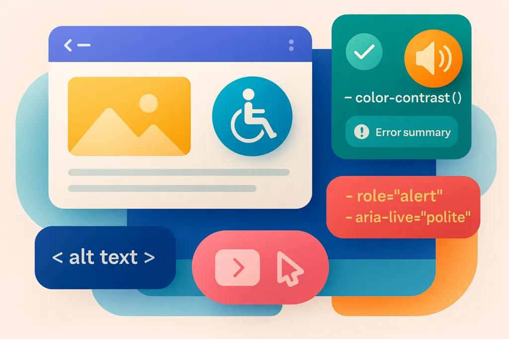
At Toasty Labs, we’ve seen firsthand how advanced accessibility measures don’t just benefit a small subset of users — they often result in better overall UX and higher conversions across the board. Here’s a deeper look at how you can move beyond the accessibility basics.
1. Re-think alt text for complex and dynamic content
Yes, we all know about alt text — but how you craft it can make or break a user’s experience. Here’s where it gets more interesting.
Context matters: the same image might need different alt text depending on where it appears. A marketing page might highlight the emotional impact (“a happy customer using our app”), while a product page might focus on function (“screenshot of the app’s scheduling dashboard”). Complex imagery: data visualizations, infographics, or charts need detailed descriptions, not just “chart of monthly sales.” Summarize the key insights — trends, peaks, comparisons — so screen reader users get the real value. Dynamic or auto-generated: if your site or app replaces images or updates them in real time (user avatars, custom dashboards), consider an AI-based alt text generator — but always review AI suggestions for clarity and accuracy. Automated solutions can help at scale but shouldn’t fully replace human oversight.
Pro tip: if you have a highly detailed illustration or infographic, link to a longer text version — a collapsible panel or a dedicated “long description” page — that offers additional context for users who want it.
2. Color contrast is important — but so is testing with real eyes
While meeting a 4.5:1 ratio is the standard, real-world contrast can differ based on display settings, ambient lighting, and user preferences.
Simulate color blindness: tools like Stark (a Figma plugin) or Color Oracle let you see how designs look to users with various types of color deficiency. Don’t overlook gradients: text over a gradient background might meet the ratio at certain points but fail elsewhere. Test the entire gradient range, not just a single color swatch. High contrast mode: some operating systems and browsers offer high-contrast modes — make sure your design doesn’t break when these settings are enabled.
Advanced tip: if you’re pushing a brand style that relies on subtle color palettes, consider an alternative “accessible” theme users can opt into, so you keep brand consistency without sacrificing readability.
3. Beyond keyboard navigation: ARIA, focus management, and live regions
Most people know about keyboard navigability, but there’s more to discover.
ARIA (Accessible Rich Internet Applications): use ARIA roles and attributes for interactive components like modals, accordions, or custom dropdowns — role="dialog" for modals, aria-expanded="true/false" for expandable sections. Focus management: in a single-page app, or after a user action like closing a modal, direct focus back to a logical element. Without proper focus handling, users who rely on screen readers or keyboard navigation can get lost in the interface. Live regions: for content that updates dynamically — chat messages, real-time notifications — use ARIA live regions (aria-live="polite" or aria-live="assertive") so screen readers alert users to changes without them constantly scanning the page.
Example: we once worked on an AI-driven dashboard that updated stats in real time. Initially, screen reader users had no idea fresh data had arrived. By adding a live region, we ensured they got gentle, context-appropriate announcements whenever key metrics changed.
4. Forms: error recovery and dynamic hints
Basic labels and placeholders aren’t enough if you really want to nail accessible forms.
Error summaries: instead of highlighting one field at a time, add a summary at the top of the form after a user submits, so a screen reader can announce all errors in one place. ARIA-describedby: if a field needs extra instructions or hints, connect them with aria-describedby — for instance, “password must include at least one uppercase letter and one digit.” Smart autofill or auto-detection: if your form can detect a user’s region or location, fill it out automatically, but confirm it can be overridden. This helps users without trapping them into incorrect data.
Real impact: a Toasty Labs client saw fewer user drop-offs after we added a dynamic error summary that read “you have two errors on this form” with links to correct each section. It saved time for everyone, especially keyboard or screen reader users.
5. Multimedia accessibility: descriptive transcripts, multiple captions, and audio cues
Videos, podcasts, and dynamic media are integral to modern apps. Let’s think bigger than “just add captions.”
Multiple caption tracks: for an international app, consider offering captions in multiple languages — some users might speak English but prefer to see text in their native tongue. Descriptive transcripts: if you have in-depth interviews, product walkthroughs, or tutorial videos, a transcript that describes key visuals or gestures can be invaluable. Audio cues and alternatives: for certain notifications or warnings, rely on more than a beep — offer optional text cues or on-screen indicators for people who can’t hear the sound.
Advanced thought: if your platform uses background music or ambient sounds, provide a way to mute or adjust it independently. This helps users with sensory processing differences, or those who simply prefer a quieter experience.
6. Plan for scalability and maintenance
Accessibility isn’t a one-and-done project. As your product grows, new features can inadvertently break compliance or worsen UX for certain users.
Accessibility audits: schedule periodic checks — automated tests plus manual reviews — to catch regressions early. Design system updates: if you maintain a design system, ensure any new component meets accessibility standards before it goes live everywhere. Include accessibility in QA: train your QA team or build a checklist that includes accessibility items — color contrast, alt text, ARIA attributes — for every release.
Our approach: we designate accessibility champions who review new designs or features. It’s cheaper and easier to fix potential issues during the design phase than after launch.
7. Advanced testing with real users
Automated tools and internal reviews are great, but nothing beats feedback from actual users, especially those who rely on assistive technologies.
User panels: build ongoing relationships with diverse testers, including people with different visual, hearing, motor, and cognitive abilities. Beta groups: roll out major features in a private beta to gather targeted accessibility feedback. Community involvement: some platforms maintain accessibility-focused groups who can offer insights or test your product.
Win-win: these real-world insights often reveal usability improvements that benefit all users, not just those needing assistive tech. Simplifying your navigation structure might help someone using a screen reader, while also making your site friendlier for mobile users.
Why advanced accessibility efforts pay off
Higher conversions and engagement: a smoother, more inclusive user experience translates into broader audience reach and less friction in key user flows. Stronger brand equity: when people realize you’ve genuinely invested in their experience, they tend to share and recommend your product. Reduced legal risk: as regulations tighten, staying ahead of accessibility helps you avoid costly compliance issues.
Bottom line: by going beyond the basics, you’re future-proofing your digital presence and building real goodwill among users who are often overlooked.
At Toasty Labs, we believe advanced accessibility is just smart UX. Whether you’re launching a new platform or retrofitting an existing product, we’d love to help you build — and maintain — a truly inclusive experience. Reach out for a no-pressure chat.
Quick recap
Alt text, done right — context-specific, detailed for complex images, reviewed rather than blindly generated. Beyond ratios — test color contrast in real-world conditions, consider color-blindness simulations, and offer high-contrast modes. ARIA and focus — proper roles, focus management, and live regions improve interactions for screen-reader and keyboard users. Advanced forms — error summaries, ARIA descriptions, and real-time validation improve completion rates. Multimedia inclusion — multiple caption tracks, descriptive transcripts, and audio alternatives. Scalable maintenance — make accessibility checks part of continuous QA, design systems, and development. Real-user testing — engage diverse testers for the most accurate feedback.