
Party Mane
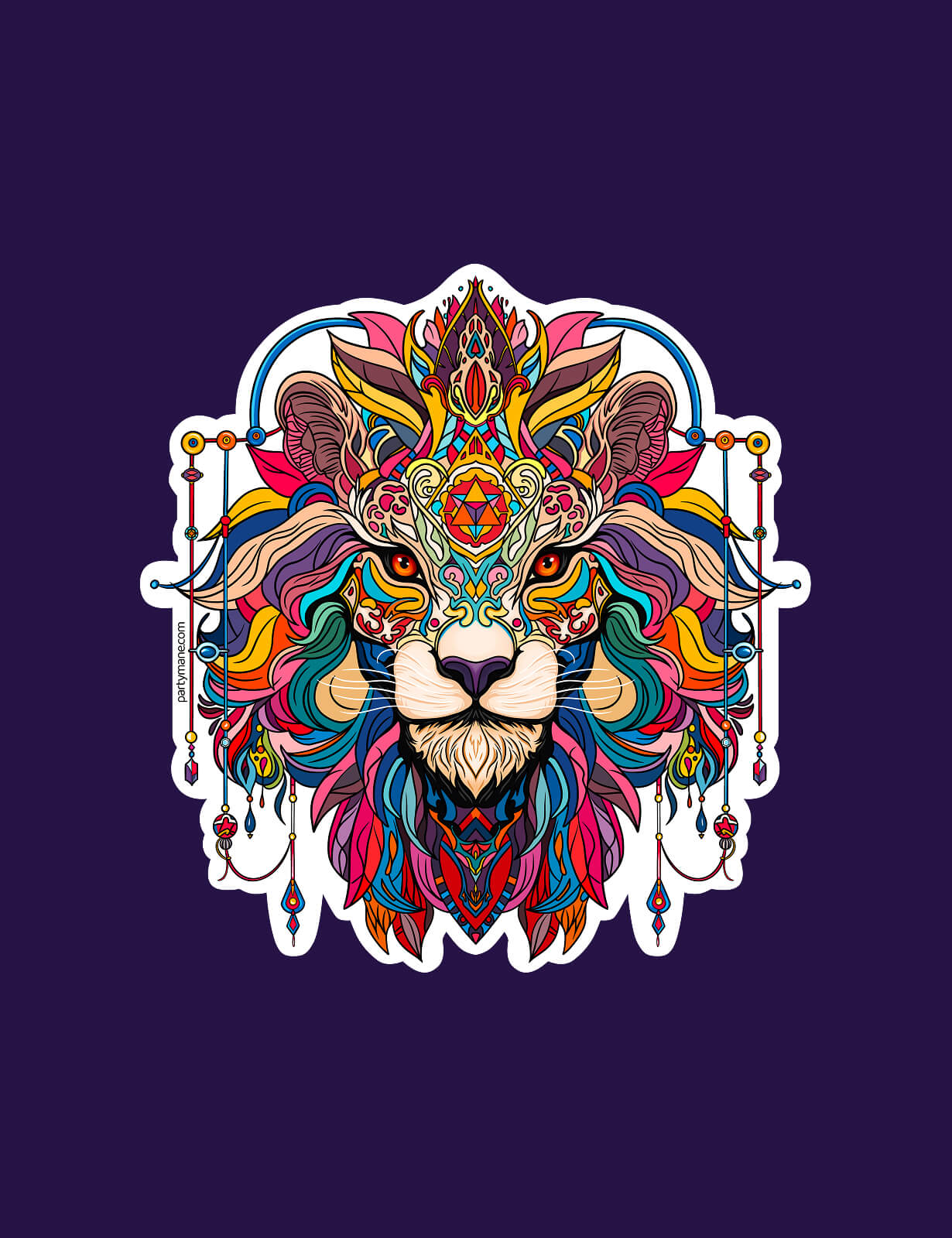
Patented, modular utility necklaces built for festivals and everyday wear. We designed the brand — including an ornate lion mark — the visual identity, the e-commerce site, and art-directed the lookbook photoshoot.
- Brand identity
- E-commerce
- Creative direction
A bold fusion of fashion and function – modular necklaces that keep your essentials close and your style sharp, from festivals to everyday life.
Logo & Symbol
The Party Mane logo features a richly detailed lion’s head, representing strength, individuality, and creative freedom. Its colorful, layered mane mirrors the brand’s modular products — bold, expressive, and designed to stand out.
The ornamental style nods to festival culture and artistic flair, capturing the vibrant, eclectic spirit of creative communities.
Ecommerce Website
We designed a smooth, intuitive shopping experience that lets the product — and personality — shine. The layout is minimal but expressive, reflecting the modular nature of Party Mane.
Lookbook
We art-directed a lookbook that reflects the bold, free-spirited nature of Party Mane. The photoshoot focused on movement, self-expression, and the everyday utility of the product.
Visual Identity
We crafted a bold and expressive visual identity that captures the brand’s spirit — free, eclectic, and functional. The color palette draws from vibrant festival aesthetics, while the typography balances personality with clarity.